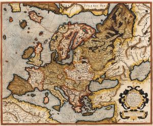
Old maps are full of curiosities, like completely mythical islands (eg, Hy-Brasil,) land masses radically out of place or duplicated, and massive changes in scale from one side to the other.
Historical map-makers had three main problems: 1. They couldn’t measure longitude, 2. Their maps were often based on compilations of lots of maps from many different sources, often resulting in confusion, and 3. Some groups were more wiling to share their maps than others. (For example, there are lots of questions about what exactly the Portuguese knew in the 14 and 1500s, like rumors that Portuguese fishermen were secretly hauling in cod off the coast of Massachusetts–more on the Portuguese later.)
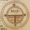
 People generally made good maps of their local areas fairly early on–the Chinese have some excellent early early maps, for example. But beyond the immediate and local, maps quickly became less detailed and more stylized, as in this “T-O” style medieval map, which obviously is not even trying to be accurate, but to express a theologic point.
Since early sailors did not usually strike out over long stretches of open water, but headed to nearby ports or islands a few days’ sail away, I suspect that most early sea charts put a great deal of effort into describing the relevant rocky shoals to avoid and safe harbors to take advantage of, and not so much effort into describing the broad curve of continental coastlines.
While latitude can be fairly easily measured by simply measuring the height of the North Star in degrees (if you are at the equator, the North Star will lie on the horizon; if you are at 45 degrees north, the North Star will be 45 degrees high in the sky; if you are at the North Pole, the North Star will be directly above you, or 90 degrees. If you can’t find the North Star, you’re south of the equator.) (Wyrd Smythe explains in more detail if you are confused.)
But there is no easy, low-tech way to determine longitude, your east-west position on the Earth’s surface. Longitude is not a huge deal when island-hopping short distances, but it becomes a huge deal once you’re undertaking multi-week trans-Atlantic or trans-Pacific voyages, where a storm can suddenly blow you days off course and you end up crashing into rocks you didn’t know were there. For example, in 1707, four British Navy warships were pushed off course by storms off the coast of England and crashed into the Isles of Scilly. 1,550 sailors drowned, prompting the British government to offer a 20,000 pound prize for anyone who could figure out a way to accurately determine longitude at sea.

The lack of knowledge and inability to make good measurements rendered even the best early maps of the world objectively terrible.
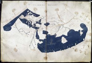
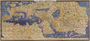
Here we have a reconstruction of Ptolemey’s world map, based on the geographical knowledge of AD 150, and Al Idrisi’s map drawn for Roger II of Sicily in 1154. Idrisi did a good job depicting Sicily, but nearby Italy is a complete mess, and he duplicates Ptolemy’s mistake of essentially depicting India as a big island (actually, probably confusion between the size of India vs. the size of Sri Lanka,) and Ptolemy’s complete confusion about the angle of Africa’s east coast.

Al Idrisi did know about the Pacific ocean and the east Coast of China, which Ptolemy did not, but his geography of Denmark and Britain are worse than Ptolemy’s, despite having been based in Europe while working.The lack of advancement in geographic knowledge available in the Mediterranean over 1,000 years is striking (though I would not be surprised to find out that folks were working with much better maps of local currents and shoals in their areas than their ancestors had been using in Ptolemy’s time.)

On the other side of the world, Chinese and Korean maps show a similar pattern. The Gangnido (aka Kangnido,) map of 1402, created in Korea, shows Korea, China, the Arabian Peninsula, and Africa. I think India is very slightly projecting from the lower-left side of the China blob, with Sri Lanka a bit more properly sized than on Ptolemy’s map.
The Gangnido map is based on an earlier Chinese map, the Da Ming Hun Yi Tu of 1398, which is very similar, but might have the Malay Peninsula.
Now, you might be thinking, as I did, that “Africa” and “Arabia” look a lot like India on this map. Wikipedia assures us that they aren’t and offers this explanation, especially since it is difficult for us non-Koreans to read the map: 
But the total lack of a Malay peninsula is really confusing, as I assume anyone traveling from China to India would be quite are of this enormous detour in their way. It’s like drawing a map of Europe and leaving off Spain.
These maps show the difficulties of trying to compile one map out of many, as your maps may use vastly different scales. The Gangnido and Da Ming Hun Yi Tu maps combine information compiled from Chinese, Korean, Japanese, Mongolian (the Mongol empire collected maps from all of its conquered nations,) and Islamic sources, eg, the voyages of Ibn Battuta.
I have noticed that no matter which explorer of south Asia we are talking about, whether Ibn Battuta, Marco Polo, Zheng He, or the Polynesians, none of them seem to have made it to Australia.
Neither do any of these early (1400s or before) maps seem to show Australia–in other words, the Chinese (and Koreans) were drawing recognizable maps of Africa and Europe before Australia.

European portolan charts appeared, seemingly ex nihilo, in the 13th century. The portolans used compass directions plus sailing directions to estimate distances between map points, thus producing a revolution in map accuracy. The compass roses are drawn directly onto the map for navigational convenience, as on this “Dieppe map” by Guillaume Brouscon, 1543.
It is getting late, so I am going to have to continue this on Thursday, when we will discuss the Dieppe maps in some depth. But let me know if you catch the most curious thing about them. ;)
As a longtime lover of maps, this was fascinating. Thanks for sharing!
As for curiosities about that last map, I’m not sure what you’re looking for, but here are some observations:
Scotland is depicted as its own island.
It’s obvious the New World and Australia were largely unexplored at the time.
The Gulf of Aqaba seems to be inflated in size and its nearby area marked as Holy Land (some variation of “Jerusalem”).
The names of various places are interesting. The antarctic land below the Strait of Magellan is labeled as “Magaillan,” all of Scandinavia seems to be labeled as some variation of “Norway,” and China’s name seems like it might be derived from “Middle Kingdom,” though I’m not certain. Florida is “Cab de Fleuride,” Argentina is “Le Brille,” Central America is “Spain Nove,” etc.
I don’t see Japan anywhere, though that could be because they didn’t have space for it.
I have a knack for missing the obvious, so perhaps none of this is what you were thinking of. Whatever the case, I’m looking forward to the next post in this series.
LikeLike
Great observations. :)
LikeLike
[…] Source: Evolutionist X […]
LikeLike
I like the old maps that connect Tasmania to the Australian mainland, omitting the Bass Strait. This phantom peninsula even contains little, natural bumps just as though it had actually been charted, rather than just imagined.
http://www.antiquemapart.com/map/191/New_Holland_with_the_Adjacent_Polynesia
LikeLike
Nice.
LikeLike
Very interesting. There is also the Cantino Planisphere, which has an interesting story behind it, which I think is the first depection of South America (c.1514…) There is an high-resolution image available through wikipedia.
all best,
LikeLike
[…] it appears that Anthropology Friday has gone on vacation. In it’s place Maps Maps Maps: A short history (pt 1/2). The map is not the territory… unless the territory is maps. Which, this time, it […]
LikeLike
The Portolan Maps is an interesting story:
http://discovermagazine.com/2014/june/14-the-mapmakers-mystery
LikeLike